When a business process values both nature and people, profit is a natural result. SICHER does not wish to engage in profit-making that negatively impacts the environment.
William Sicher Wijaya, founder
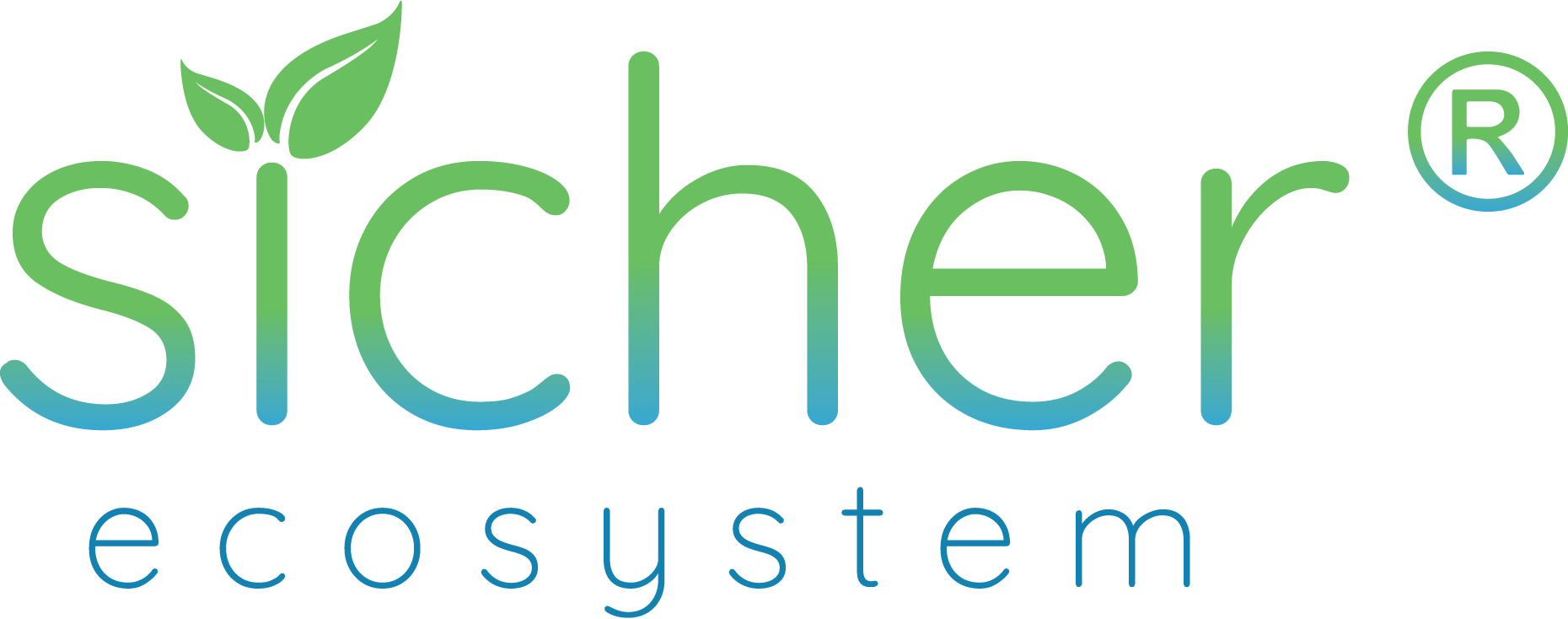
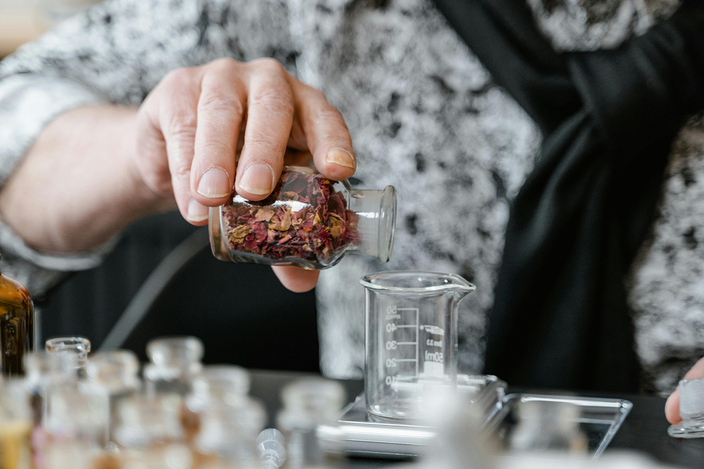
As a startup centered around aromatic innovations, we draw inspiration from the uncharted capabilities of scent technology. Our aim is to improve everyday life through fragrances that spark recollections, enhance emotions, and forge enduring memories, all while being gentle on the planet. The SICHER Ecosystem logo uses smooth, rounded typography with a green-to-blue gradient, reflecting sustainability, innovation, and harmony with nature.
The SICHER Ecosystem logo uses smooth, rounded typography with a green-to-blue gradient, reflecting sustainability, innovation, and harmony with nature.
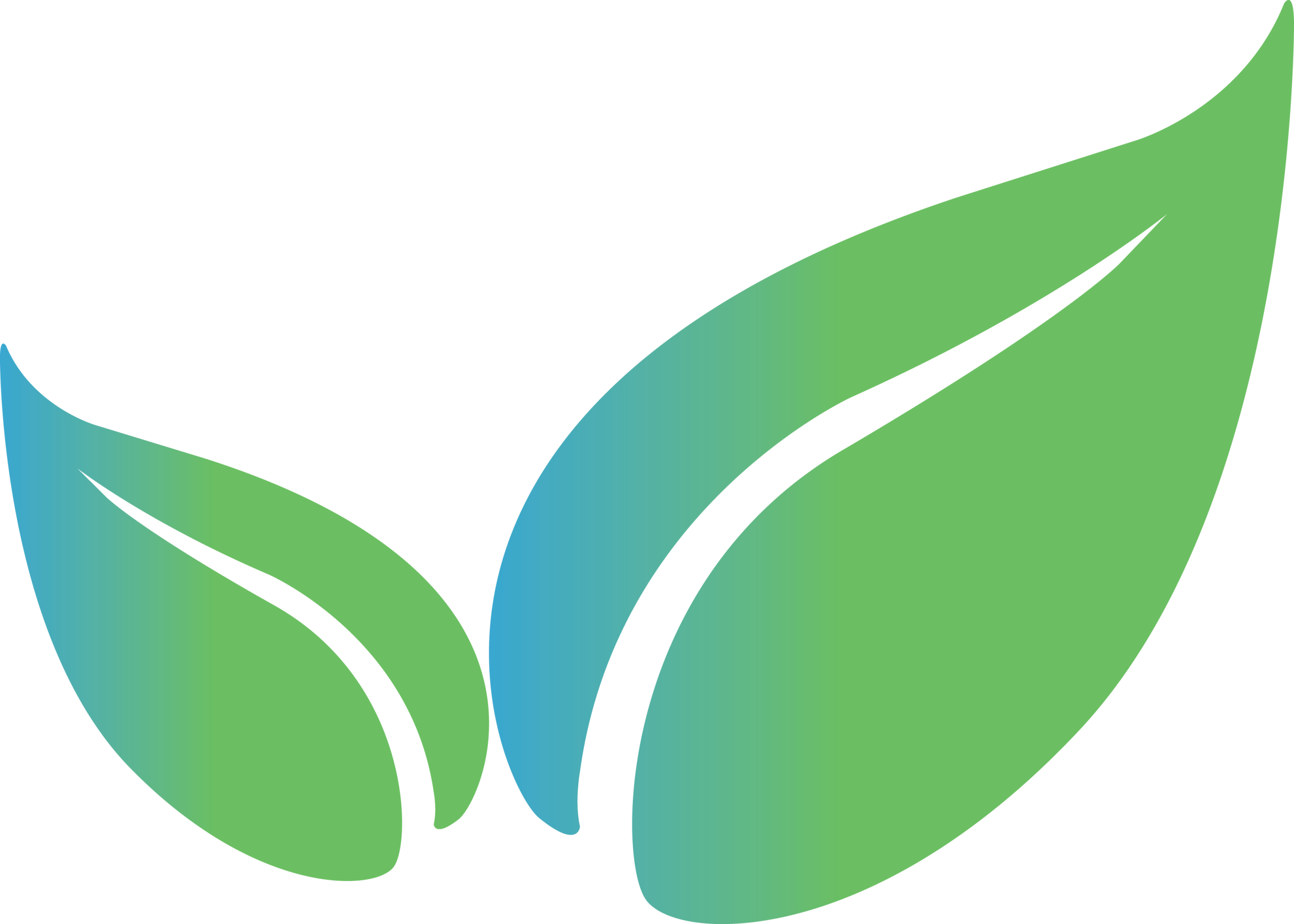
Leaf
SICHER’s deep commitment to nature and sustainable ecosystems. The twin leaves represent growth and regeneration, which are core to the brand’s mission of building eco-conscious, people-centered businesses.
Flowing “S” Shape
The organic curve of the “S” mimics the flow of air or fragrance, representing olfaction, aroma science, and the seamless fusion of function and beauty. It is a nod to the sense of smell and the natural elegance of the brand.
Rounded Letters “e” and “c” (Mouth and Smile)
These shapes suggest a smile or an open mouth, conveying warmth, sincerity, and openness. It reflects the brand’s intention to connect with people emotionally and deliver joy through its products and experiences.
Rounded Typeface (Embracing Hands)
The soft and circular typeface resembles gentle, embracing hands. This visual language represents nurturing relationships, inclusive partnerships, and the care for both community and environment.
Gradient Colors
Blue
Innovation, science, progress
Green
Nature, life, sustainability
SICHER
The transition from green to blue illustrates SICHER’s fusion of natural origins with modern science, representing its eco-system mindset.